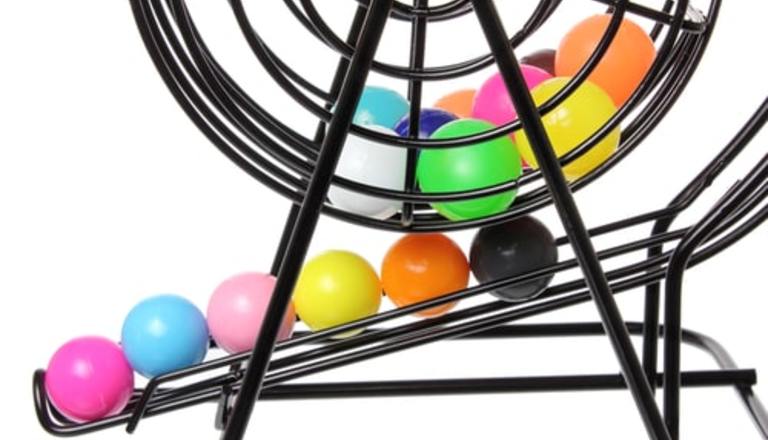

How colour can be a marketing tool for lotteries
Lottery and game marketing encompasses a large variety of varying factors to attract lottery players and not only get them to buy, but keep them buying. Everything from geometric designs and logos to music and sounds are researched so operators and their marketing departments can target various demographics of potential lottery players. Now, with that in mind, did you know that colour is one important aspect of this lottery game design?
Colour as a Marketing Tool
Colour is a major marketing tool for lotteries. In marketing the lottery and various games available to play, colour design is extensively market researched and incorporated into the graphics being designed for each particular game. Since colours naturally tap into the psyche of potential players, like most manufacturers and retailers, colours can be used to influence people to play the lottery or a particular game.
For instance, blue is considered to a masculine colour, and is used to target men, butis also the colour of trust and reliability. The darker the shade of blue that is used, the more professional or serious a product is perceived. Going with lighter blues presents a more creative or lighthearted representation. Blue can also contribute to a person’s calmness and security. Blue can be a tranquil and refreshing colour, bringing about a feeling of relaxation and peace.
Pink is considered to be primarily a feminine color and is used most often to target female players. Pink is considered a “girly” or “feminine” colour, and is perceived to be a colour that exudes fun, sweetness, and romance. Pink is usually used for scratch tickets that evoke female emotion. So many valentines scratch tickets usually have pink hearts as graphics or prize symbols.
Green is seen as a natural colour and of course represents nature. It also is associated with wealth and health. Green can also be used to present feelings of good luck, good feelings, and financial peace. So it is not surprising to find green being used for both graphics and prize symbols. Since green is non-gender, it works well for St. Patrick’s Day draws.
Purple is most often used as a way to show success, uniqueness, and imagination, along with mystery, luxury, royalty, magic, and spirituality. Purple has always had a connection to royalty and the upper echelon of wizards, magicians, and jesters. Using in purple for lottery marketing targets the more “upper crust” player, one who may spend a bit more on draws and tickets than the average player.
Red represents both passion and appetite. It reaches out and grabs a player’s attention immediately, not only for gambling, but for eating as well. Many casinos use red in their dining areas to get people hungry and into the restaurants and buffets. And as it does for the belly, it does for the wallet. Red also creates feelings of excitement and passion and the need to go get what you want. It is a high-energy colour used to get a person charged up and go for it. Red entices players to buy.
Orange is the color of vitality and fun! Orange stirs the youthful energy in players and attracts them with the perception of humour, youthfulness, and affordability. It is a colour that triggers the more innocent or childlike psyche we all have but put aside as we have become adults. Yellow is used to represent optimism, excitement, positivity, happiness, light-heartedness, and affordability. Yellow is happy and soothing colour that brings out the joy in players and reduces any reluctance in spending their money. More often than not, orange and yellow are used together to create a marketing colour palette that magically brings out a player’s satisfaction in playing and buying.
Black is used to represent authority. Now you know why most text used a lottery on products and advertising is black. It also brings feelings of luxury, formality, elegance, and power. In fact, when orange, yellow, and black are used together in logos, signage, kiosk colouring, and prize colours, the three can be extremely effective in creating the desire to buy and reducing the logical thinking of rationalizing the purchase when combined with one or more of the other colours.
Next time you visit your local lottery retailer, check out the colours used for the kiosk, machines, logos, scratch tickets, etc. You will be amazed how simple colours used in the right way can influence our decision in purchasing that ticket.